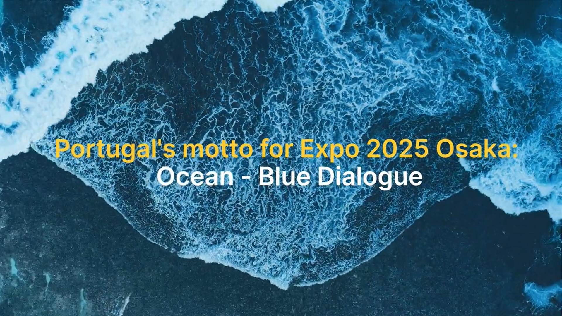
The visual identity of Portugal's participation in Expo 2025 Osaka
It's time to listen to the voice coming from the sea. But this voice is not a call from times gone by; it is a call from the future.Manuel Alegre, Portuguese poet
The ocean-inspired the concept for the visual identity of Portugal's participation in the world expo in Osaka, Kansai. The logo has a shape that results from a puff of wind, where all the parts intertwine, allowing for an ever-changing view of what is happening at the Portuguese Pavilion. The colours - blue, yellow and red - reflect the ocean, the light and the red of Japan.
Conceived and designed by AICEP designer Filipa Pias, the visual identity of Portugal’s participation is based on the architecture of the Portugal Pavilion and the Ocean, a source of life that is home to an ecosystem capable of simultaneously generating 50 per cent of the oxygen we breathe and absorbing 25 per cent of CO2, as well as being able to capture around 90 per cent of the excess climate heat caused by greenhouse gas emissions.
It also reflects Portugal's tradition of universalist and oceanic culture, a platform for relations between continents and cultures, pioneering the theme at Expo'98 in Lisbon, where the aim was to sensitise the international community to the protection and preservation of the "Oceans: a heritage for the future".
In her creative process, Filipa Pias was inspired by the Portuguese Pavilion. "The Pavilion designed by architect Kengo Kuma favours the ocean and the dialogue, modulated by the form that is permanently recreated by the action of the wind, simultaneously flexible and resistant, thus highlighting the interdependence of systems and the need to build bridges that embrace, care for and protect the future,' explains the designer, concluding: 'The main challenge is to comprehend that we are all part of a single system, where our well-being is not independent of our collective well-being."


